Presenting Tap Type, a new and exciting collaborative project launched on the 26th of March 2017. We spoke to designer Rich Norgate who kindly gave us an insight into the creative process and general happenings of the project. Scroll down to read on..
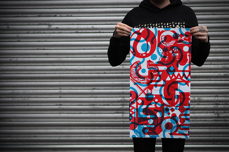
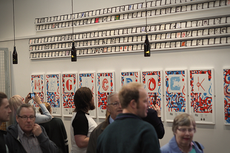
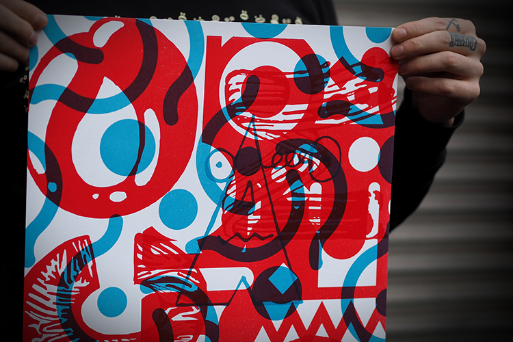
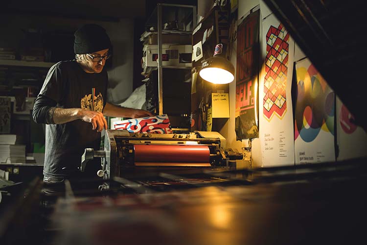
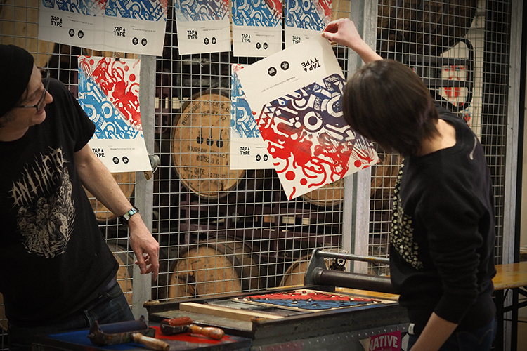
Traditionally type foundries would create a typeface in wood or metal. In his studio, Nick has the ability to cut wooden plates out using a laser cutter, and we used this method to create unique and customised shapes taken from the chosen beermat submissions. Whilst modern technology has allowed this flexibility, the process of printing is still traditional, using an inked up roller on the impression, which is then pressed onto the paper.
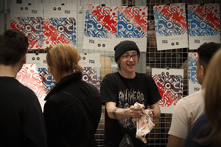
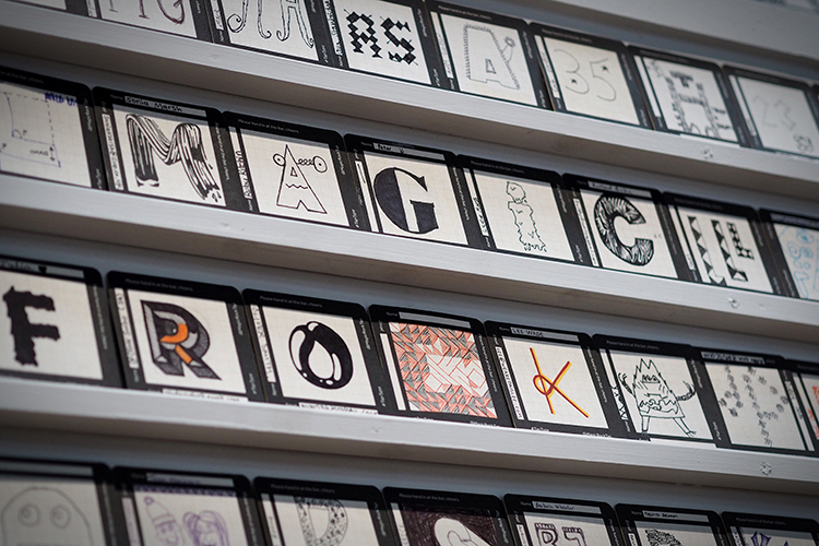
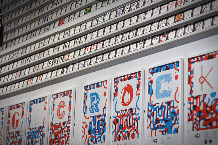
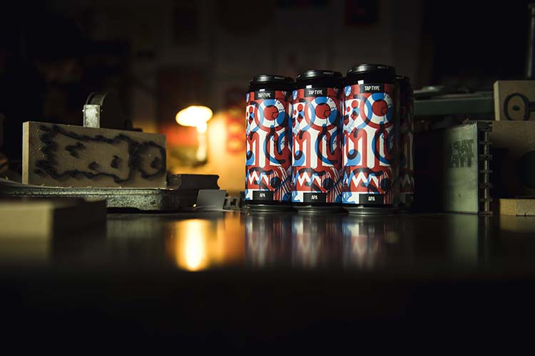
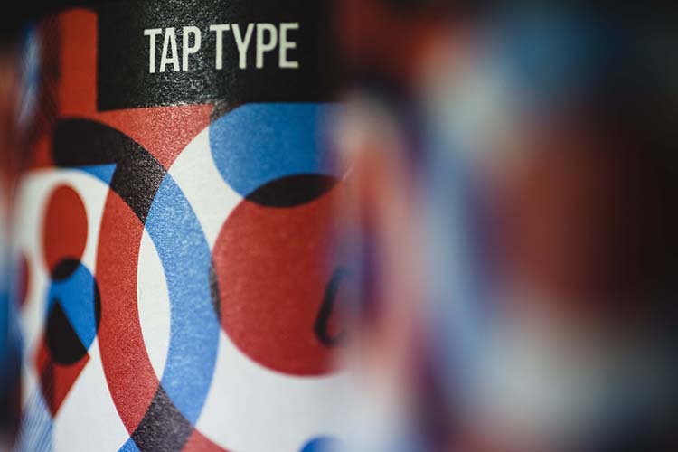
There are 9 individual type posters forming the exhibition plus an individual montage of all the letters. I created a montage from the individual prints to create the label for a new beer “Tap Type APA” that we’ll be launching in conjunction with the exhibition. In addition to this we exhibited all the submitted beer mats.
Both the beer and exhibition were launched on Sunday 26th of March (Mother’s Day). We had a great turn out and both the beer and prints were received well. It was great to see so many kids working with Nick on some live printing on his press.
The exhibition will run until the end of June, limited prints are available from the Taproom and they’ll be in our online shop soon.
Tap Type APA is a super drinkable 6% American Pale Ale using Citra and Mosaic T90 and Cryo hops in the whirlpool and dry hop respectively, allied to a malt bill of Golden Promise, Wheat, Oats and Acid Malt. The 500ml cans are available to buy from our Taproom and online via our website.”
No comments:
Post a Comment