Last month, indie magazine fans from all over the world united at Central Saint Martins for MagCulture’s annual Modern Magazine conference. With speakers including Gail Bichler from The New York Times Magazine, Penny Martin from the Gentlewoman and Kai von Rabenau from Mono.Kulture, the day was packed with inspiring stories and insights into magazine making. 
Amsterdam-based MacGuffin magazine is dedicated to exploring ‘the life of little things’. Editor-in-chief Kirstin Algera explained how even mundane, boring objects can generate exciting stories. Each issue is themed around a different item, which so far has included the bed, window and rope. Subjects of previous features range from a man’s vast rope collection to the trend in Amsterdam homes of filling windows with an elaborate display of plants. Each story is focused on the people and human experiences that the different objects reveal. The friendly, warm-feeling typeface used throughout the magazine was chosen to reflect the personal storytelling nature of its content.
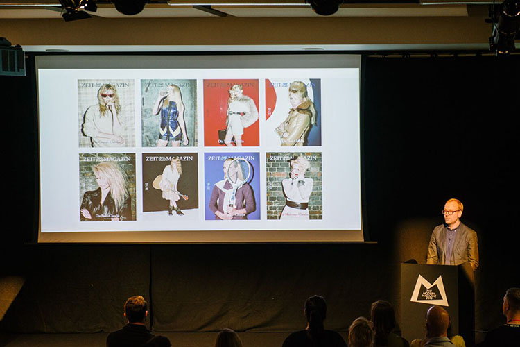
ZEITmagazin is one of the world’s most creatively-charged newspaper supplements, found tucked inside Germany’s weekly Die Zeit paper. Editor-in-chief Christoph Amend talked through the magazine’s double-cover format, and how he believes the cover has become a journalistic form. For example, a recent coverless edition displayed the bare editor’s note on the front (‘women seemed to get it more than men,’ he said with a smile). The magazine’s 40th birthday issue ran with an astonishing 40 different covers, featuring model Claudia Schiffer who turned the same age that year. Christoph also introduced the audience to ZEITmagazin Mann, which launched six weeks ago with the aim of celebrating men who decide to become happier.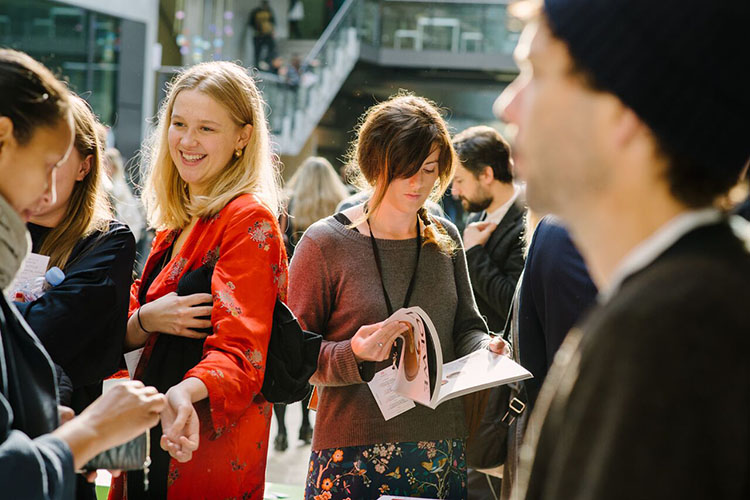
‘Print for us is thriving,’ Empire editor Terri White told a presumably delighted audience. Officially the world’s largest movie magazine, Empire is blossoming in a world where people have never watched more film. Taking a holistic approach to the movie watching experience, the company now also publishes podcasts and hosts an 8,000-person event called Empire Live. Terri emphasised the importance of publishers not trying to speak to every person every time. The readers that listen to Empire podcasts are probably very different to those that would attend an event, for example.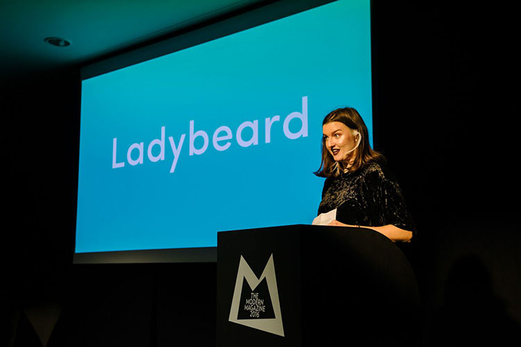
Feminist publication Ladybeard tackles important issues, such as sex or the mind, that mainstream women’s magazines either misrepresent or avoid completely. For example, the recent mind issue reimagines mental health as an everyday part of life, rather than a problem that needs to be solved. Packed with more than 70 different contributors, the hefty magazine wants to represent as many different voices and perspectives as possible.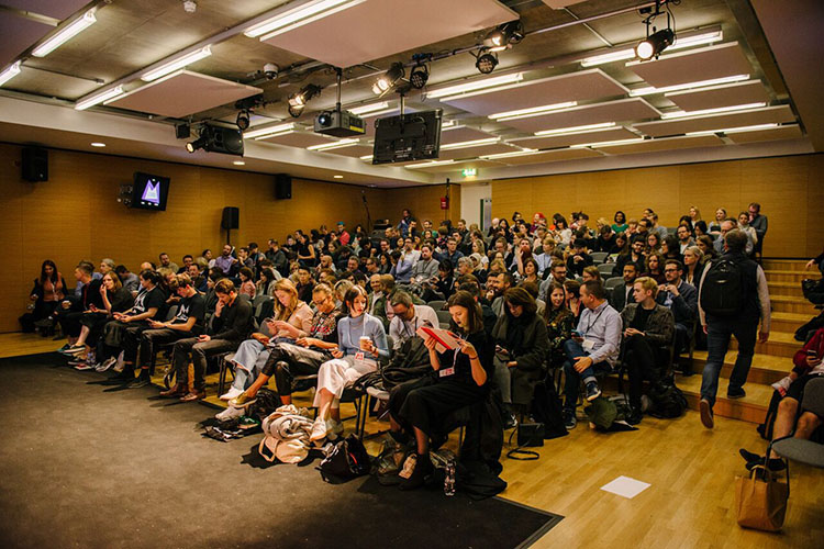
The Real Review is a pocket-sized publication with an expansive proposition to analyse ‘what it means to live today’. The quarterly magazine is the flagship publication of the ŘEAL foundation, an architectural firm with a social and political agenda. Real Review news editor Jack Self spoke to the audience about how it addresses issues around spacial equality and access. He also emphasised the collaborative nature of magazine making, a theme that had also been touched on by the Ladybeard team.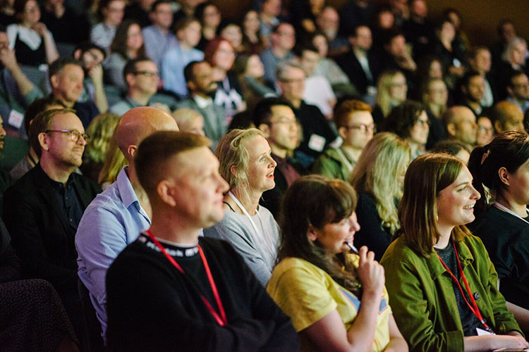
Rebecca spoke about her journey into journalism from creating fan zines as a teenager and what she’s learnt in her one-year tenure as UK editor of Vice. ‘Don’t set false limitations,’ she said, such as arbitrary word counts. For example, a recent Vice.com story was only four words long, reading ‘Dear 2016, fuck you.’ Another piece of advice was to ‘Look for the alternative point of view.’ She explained that a Vice story is one you wouldn’t read anywhere else or an angle that you would read anywhere else.
Legacy: The Story of The Face by Paul Gorman is about the history of the iconic magazine, which ran 1980 – 2004. ‘It exists as a silent infamy,’ Gorman told the audience. ‘Its approach has been absorbed by modern magazine making but also in the way that we consume visually.’ He claimed that the 230 archived issues are like a window into the final two decades of the 20th Century.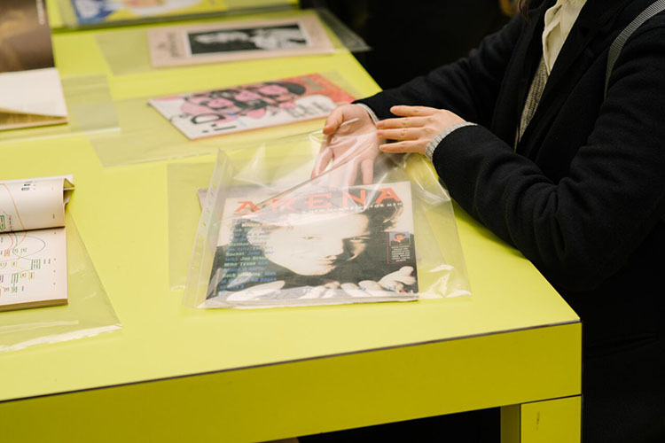
‘Format = Everything,’ said Kai von Rabenau of magazine publishing. He claimed the most important decision he made for Mono.Kulture was deciding its format of one artist and one interview per issue. The publication has never included advertising, which allows for greater creative freedom. For example, one issue interviewed a perfumer and so ran with plain, scented pages instead of images.
When it was founded in 2010, the Gentlewoman chose to tread a different path to mainstream women’s magazines. Editor-in-chief Penny Martin explained how her team set out to celebrate all kinds of women, not just the A-listers (or various ‘Jennifers’) that were plastered all over mainstream mags at the time. ‘The word ‘sexy’ is banned from our magazine,’ she told the Modern Magazine audience, adding that her team are feminists but take a ‘show don’t tell’ approach to gender politics. For example, all the models featured in the fashion pages are named and treated as people rather than objects. The Gentlewoman also seeks to distinguish itself from the way mainstream magazines address the reader as a customer, ‘as if poised ready to buy something,’ said Penny. Its editorial style is to emphasise clothes rather than fashion and conversation over product. ‘We take the affectionate and encouraging tone that women have for each other when men aren’t in the room,’ said Penny.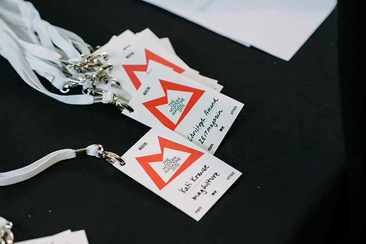
The former editor-in-chief of Private Eye Tony Rushtan engaged in conversation with Jeremy Lesley, describing his experiences working for magazine during his 50-year tenure. He described the current-affairs publication as like ‘a sugared pill’: it is serious at the core but has a sweet coating. The sugar he referred to was the magazine’s sense of humour. In fact, the hardest part of hiring his replacement was finding someone who could do serious journalism as well as the jokes. When asked if thought the magazine’s content was still up to scratch, he answered that it was of course, as there was so much good material to use these days. ‘The more embarrassing the government gets, the better the content,’ he said.
‘It’s not a literary magazine in the general sense, but rather a general interest magazine for avid readers,’ said Seb Emina of his publication The Happy Reader. The magazine was born out of a partnership between Fantastic Man and Penguin, causing its paradoxical nature of being both independent and branded. The format of the magazine is in two halves, the first being an interview with a bookish celebrity. ‘By talking to someone about their reading habits, you get to know them pretty well,’ said Seb. The second half of the magazine has a variety of features and stories based around the theme of one novel. ‘It’s like a book has been invited to be guest editor of Vanity Fair or the Gentlewoman.’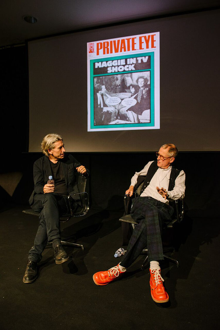
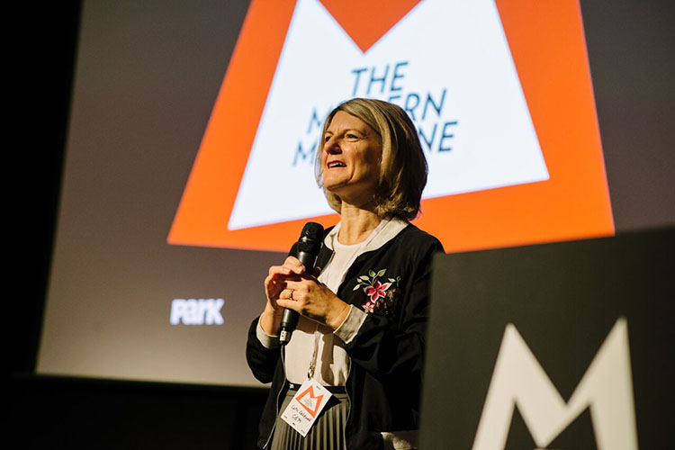
As design director of The New York Times Magazine Gail has created some of its most iconic covers. Gail talked through her process of coming up with the concepts, which starts by encouraging her editor to boil down the lead story to one single sentence. She said that typographic covers are a great way to get around hard-to-illustrate subjects and that her team often make the things that feature on the covers. For example, for the image showing Donald Trump’s face floating off on a helium balloon, the art team designed and printed the balloon from scratch before photographing it.
No comments:
Post a Comment