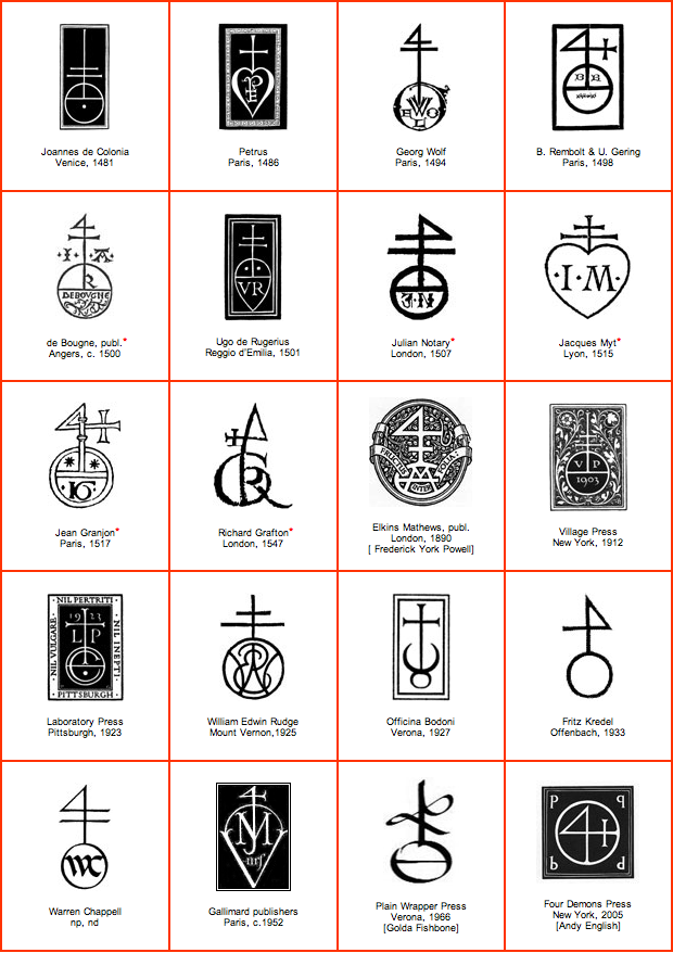
If you’ve worked with us, chances are you’ve seen this mark somewhere. It’s our version of an old printer’s mark from the Renaissance, then called a Colophon.
Colophons were often composite marks made from the alchemical symbols printers used to produce the metal type they put in their presses, personal heraldry, or imagery from local culture.
This design, or variations of it, was used by printers, bookmakers, and publishers in various forms as a trademark in Venice, Italy, from around 1470,[1][2] most notably by master printer and typographer Nicolas Jenson, a student of Johannes Gutenberg, and inventor of the typeface Roman Jenson, which was the basis for fonts like Garamond and Goudy Old Style.[3][4]

Nicholas Jenson’s Printer’s Mark in Venice, Italy, 1481
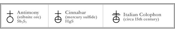
Its structure is derived from the alchemical symbol for Antimony (Sb, #51 on the periodic table).
Sb is from the Latin stibium meaning “mark” since it was first used as a cosmetic.[5]
Printers used Antimony in the production of movable type, which is made from three elements:
Lead, Antimony, and Tin.
Lead, derived from Galena, and Tin from pewter were commonly used by all printers at the time.[6] The reason Antimony is important enough to become a mark used for centuries by printers is because it represented a great step forward in the science of printing during the 15th century, resulting in a greater durability and precision of lead type.[6]

Some symbols from books of alchemy, 1400-1550. Antimony and Cinnabar highlighted in red.
Antimony occurs naturally as a blackish silver sulphide ore called Stibnite, which printers would pulverize and add to their mixtures of lead type.[6] This new alloy would fill their molds better and achieve finer detail in letter forms due to its rare property among metals of expanding as it cools from a liquid to a solid.[7] It also made the type harder and stronger, allowing them to print longer runs with cleaner edges.[8] It became a symbol for quality and was used as a general printer’s mark for fine printing throughout the Renaissance.
Given the mining/refining technology of the day, alchemists and printers had to work with what they could find. Antimony was commonly found with a Mercury sulphide ore called Cinnabar [9], used at the time as a pigment in red inks, known as Vermilion.[10] It’s possible that Antimony was discovered while harvesting Cinnabar crystals since they are commonly found together and are both found in Italy.[11][12]

The popular usage of red and black ink, still the most popular colors in print today, might be responsible for the accidental discovery of Antimony as an additive to the type making process.
It was common practice then to re-melt old worn type and cast new types from it. Undoubtedly, some of the vermilion ink, and the Cinnabar it was made from, would have made it into the mix, producing a better alloy. Cleaver printers, realizing that their type got better after successive re-melts, may have begun adding it to their initial mixtures of Lead and Tin.
Details are sketchy as alchemists were secretive about their work and surviving information is hundreds of years old, but combining the alchemical symbols for Cinnabar and Antimony (Stibnite ore) to form the mark for the new Lead alloy used by printers is highly probable.[13]
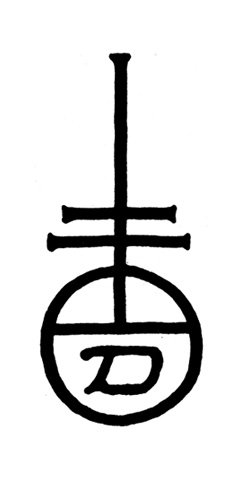
Not long after the mark was put into common use, probably because most of the first books printed then were copies of the Bible and this mark would appear in vermilion on title page, it became associated with Christianity, leading to the idea that it was the Patriarchal Cross over the earth, which still happens today. Whether or not printers were complicit in this is unclear, but it’s possible as, like today, they probably would do/say just about anything to keep their clients happy.
By using this mark we humbly hope to pursue printing in the same brave, innovative, and quality-driven methods as our printing forefathers and pay respect to what they achieved in a time when making marks on paper with a machine was much more difficult.

1. Graphic Arts Company, Boston (1923). Historic Design in Printing. p. 186.
2. University of Illinois Library (1983). Printer’s and Publisher’s Devices.
3. Nicolas Jenson. In Wikipedia. Retrieved February 24, 2010, from http://en.wikipedia.org/wiki/Nicolas_Jenson
4. History of Printing. Retrieved February 24, 2010, from http://www.printlocal.com/History-of-Printing.htm
5. Antimony. In Wikipedia. Retrieved February 24, 2010, from http://en.wikipedia.org/wiki/Antimony
6. Type Metal. In Wikipedia. Retrieved February 24, 2010, from http://en.wikipedia.org/wiki/Type_metal
7. Antimony. Mineral Information Institute, Retrieved February 24, 2010, from http://www.mii.org/Minerals/photoant.html
8. Antimony. Chemistry Explained, Retrieved February 24, 2010, from http://www.chemistryexplained.com/A-Ar/Antimony.html
9. Stibnite. Peterson Field Guide to Rocks and Minerals, by Frederick H. Pough, published by Houghton Mifflin Company, http://answers.com/topic/stibnite
10. Cinnabar. (2010). In Encyclopædia Britannica. Retrieved February 24, 2010, from Encyclopædia Britannica. Retrieved February 24, 2010, from http://www.britannica.com/EBchecked/topic/118096/cinnabar
11. Cinnabar. The Columbia Electronic Encyclopedia, 6th ed. Copyright © 2007, Columbia University Press. http://www.infoplease.com/ce6/sci/A0812273.html
12. Stibnite. In Wikipedia. Retrieved February 24, 2010, from http://en.wikipedia.org/wiki/Stibnite
13. Antimony & Cinnabar. Symbols in Books of Alchemy. Retrieved February 24, 2010, from http://www.lib.umich.edu/tcp/docs/dox/alchem.html
No comments:
Post a Comment