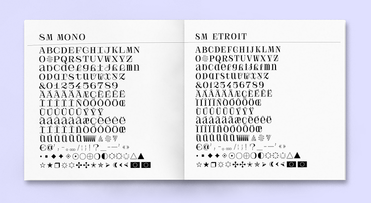
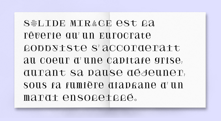
A unique collaboration between type foundry Velvetyne and French music band Frànçois & The Atlas Mountains has lead to the recent launch of a brand new font for the next album of the music band, called Solide Mirage, from which the typefaces got their names. Established for over 7 years now, Velvetyne were the first open-source type foundry in France steadily building up a renowned international reputation. This project was born from collaboration of both creative groups and began when the music group came to Velvetyne and asked for them to design their band logo.
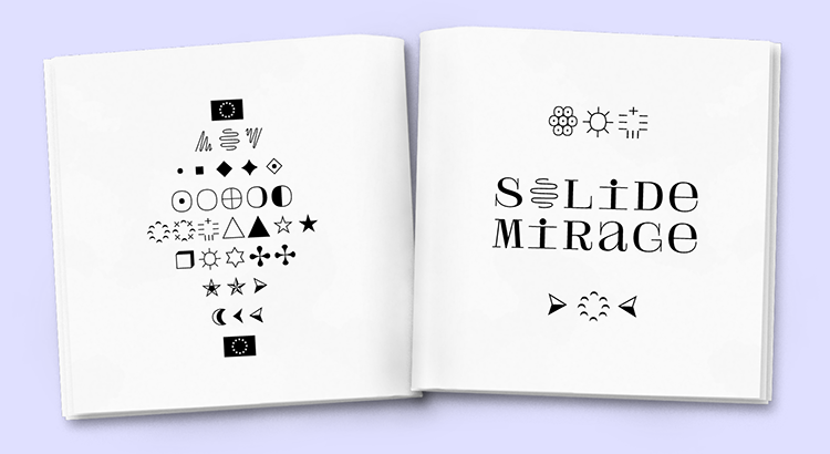
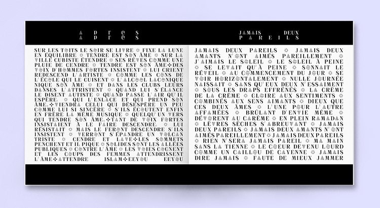
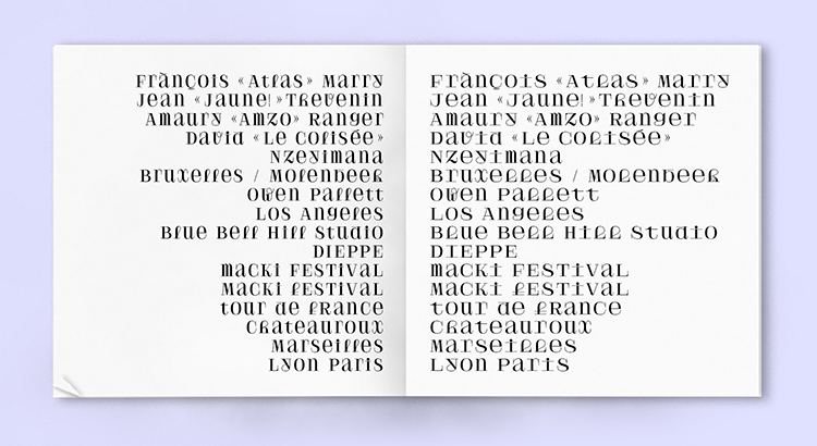
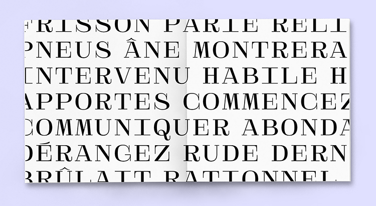
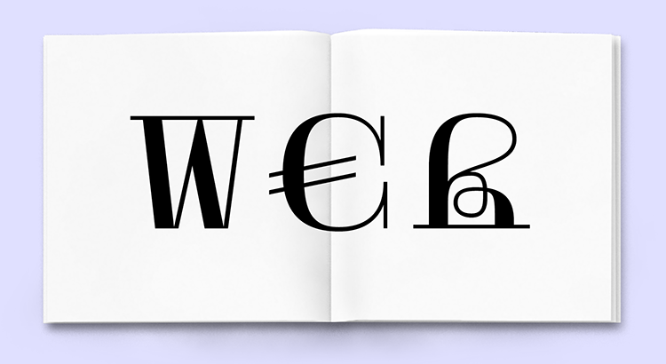
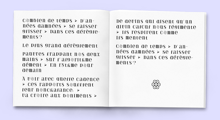
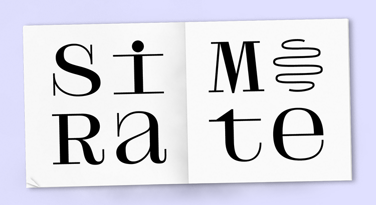
Velvetyne describes their creative process: “Bodoni faces appeared to be an obvious inspiration as it was used in several versions on all the band’s media channels. As the fonts always were set in caps, we decided to draw an unicase, allowing the band to mix different shape families by stirring lowercases and uppercases together. If the caps remains quite classical, the lowercases would show a stronger temperament. All the lowercases that should have ascenders or descenders, as the b, d, p or q are the most surprising, with their compressed shapes and long serifs. Solide Mirage began as a squared monospaced typeface, for practical layout reasons, quickly followed by a proportional companion, a more narrow design to allow subtler text layouts. Both typefaces have ornamental alternatives A, O and V, inheriting the zig-zag spirit of the album cover created by the visual artist Tatiana Defraine. A small set of ornaments have been drawn too, widely used in the album leaflet.”
The decision for the typeface to be free and open-source was an easy call to make. The rational was that the band wanted the font to have its own life while their fans wold be able to understand the albums meaning and emotions embedded within the songs. For more info check the link below!
https://www.velvetyne.fr/
http://velvetyne.fr/news/solide-mirage/




No comments:
Post a Comment