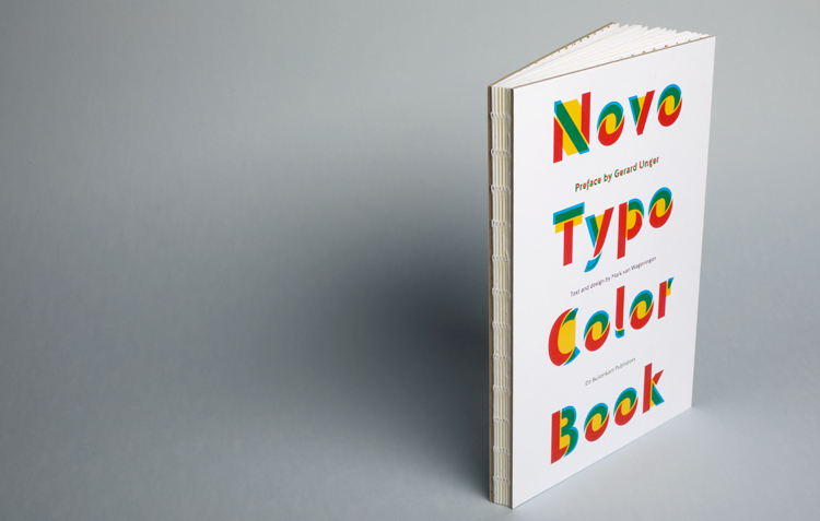
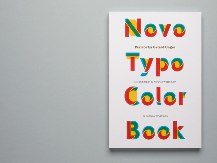
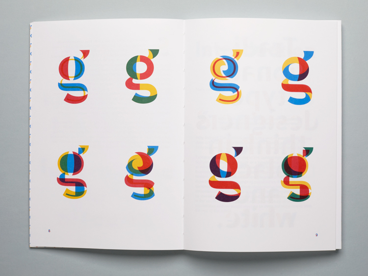
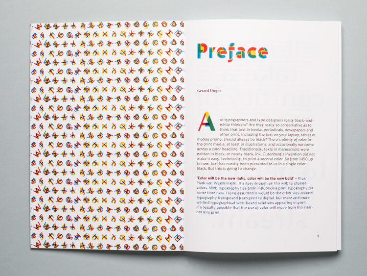
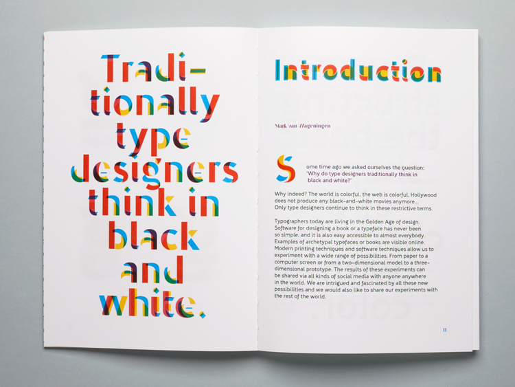
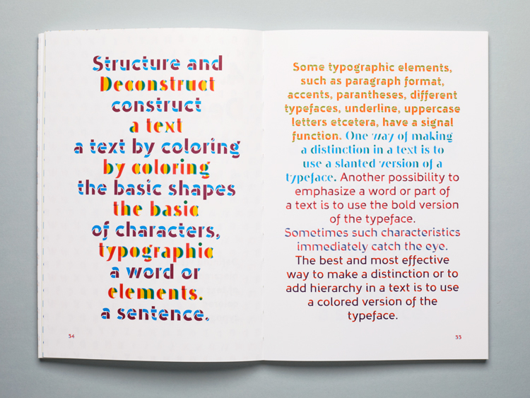
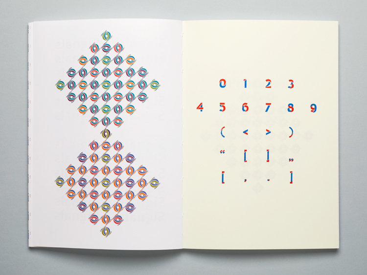
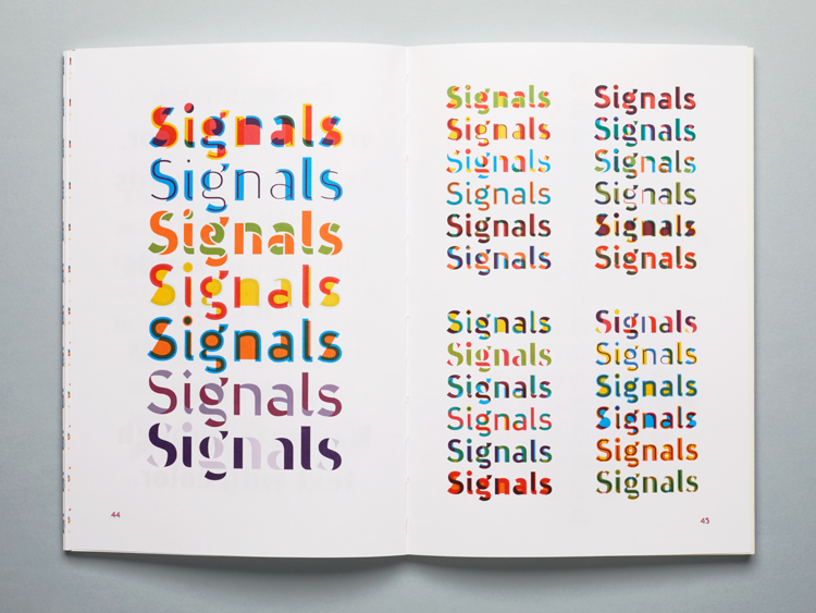
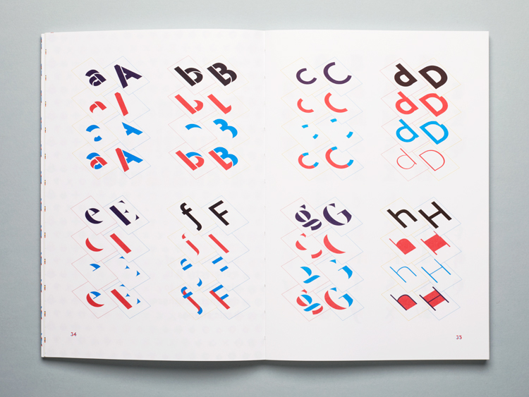
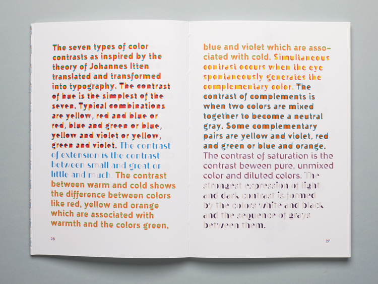
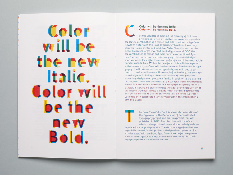
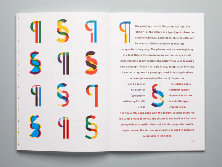
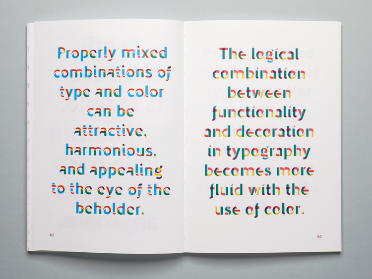
Novo Typo is an independent typographic design studio and foundry, based in Amsterdam, The Netherlands. One of their most recent projects discusses the question, why do type designers think in black and white? We’re surrounded by a world of colour, from our screens to our homes, colour plays a significant part in our daily lives. However why is it that typographers and type designers creations live in such restrictive circumstances. Novo type began exploring this relationship and constructed a publication based on the concept of how varied techniques that exist today have affected the designs of typography.
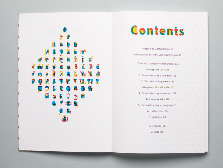
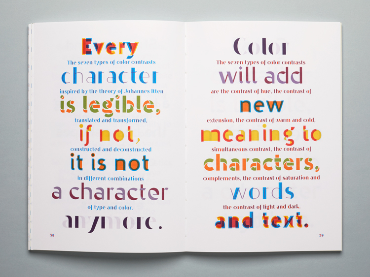
Filled within the type-utopian pages, are Novo type’s own font designs, their design approach expressing that readability and legibility is overrated. “Every character is legible, if it isn’t, it’s not a character” says Novo. Exploring the use of colour in typography and type design, Novo extends its ethos and presented a piece of print that embodies it through and through. To create something more fun. “We’re not interested in designing a new Helvetica or Univers, simply because these typefaces already exist.
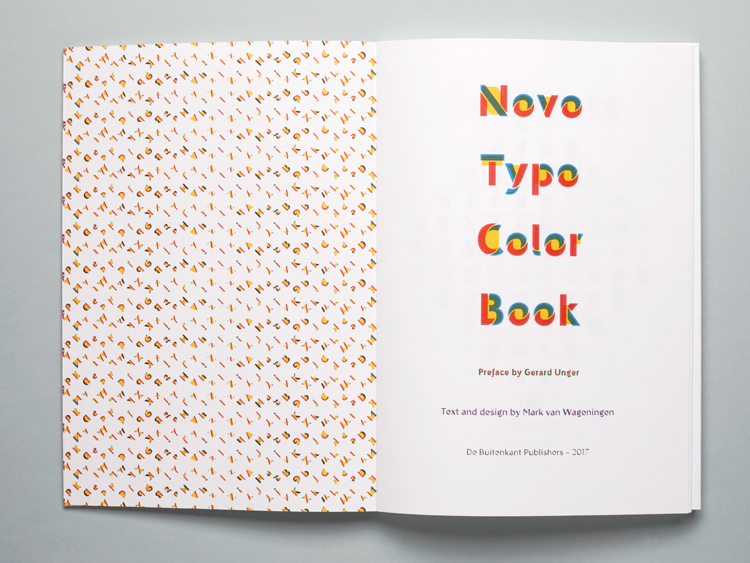
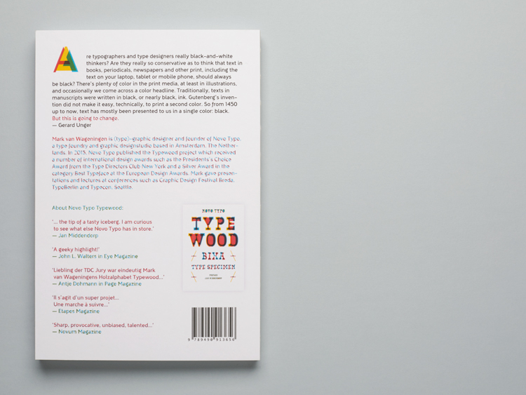
Published by De Buitenkant in Amsterdam, The Netherlands. This 96 page publication is printed with 3 pms colours offset and letterpress. Order your copy here: www.uitgeverijdebuitenkant.nl.
All fonts by Novo type are available via their web shop, offering possibility to redesign typefaces to its customers needs. Novo Typo is also available for designing and producing customized typefaces.
http://www.novotypo.nl/index.html



No comments:
Post a Comment