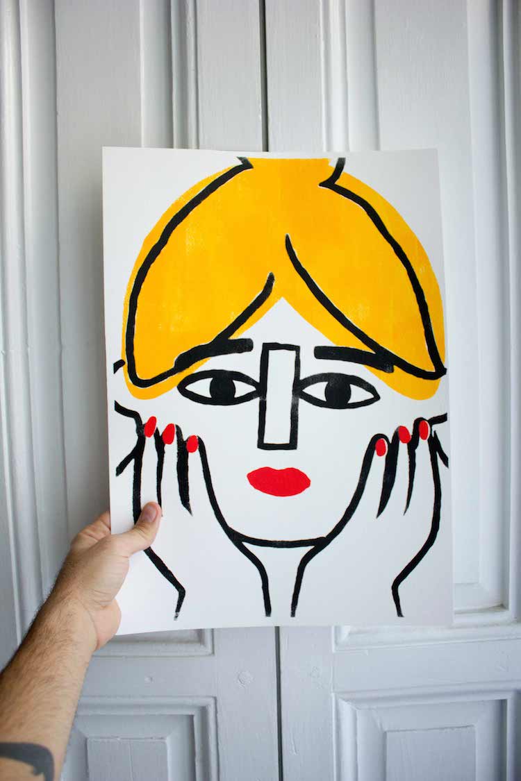
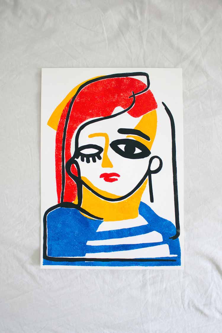
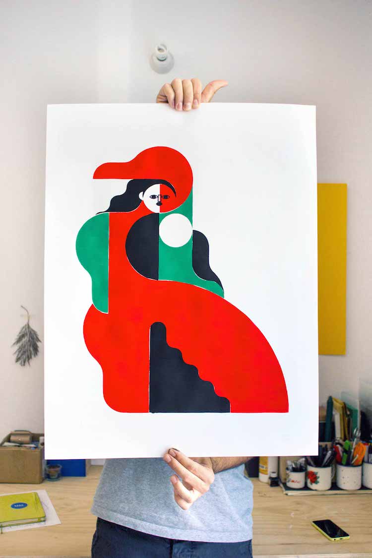
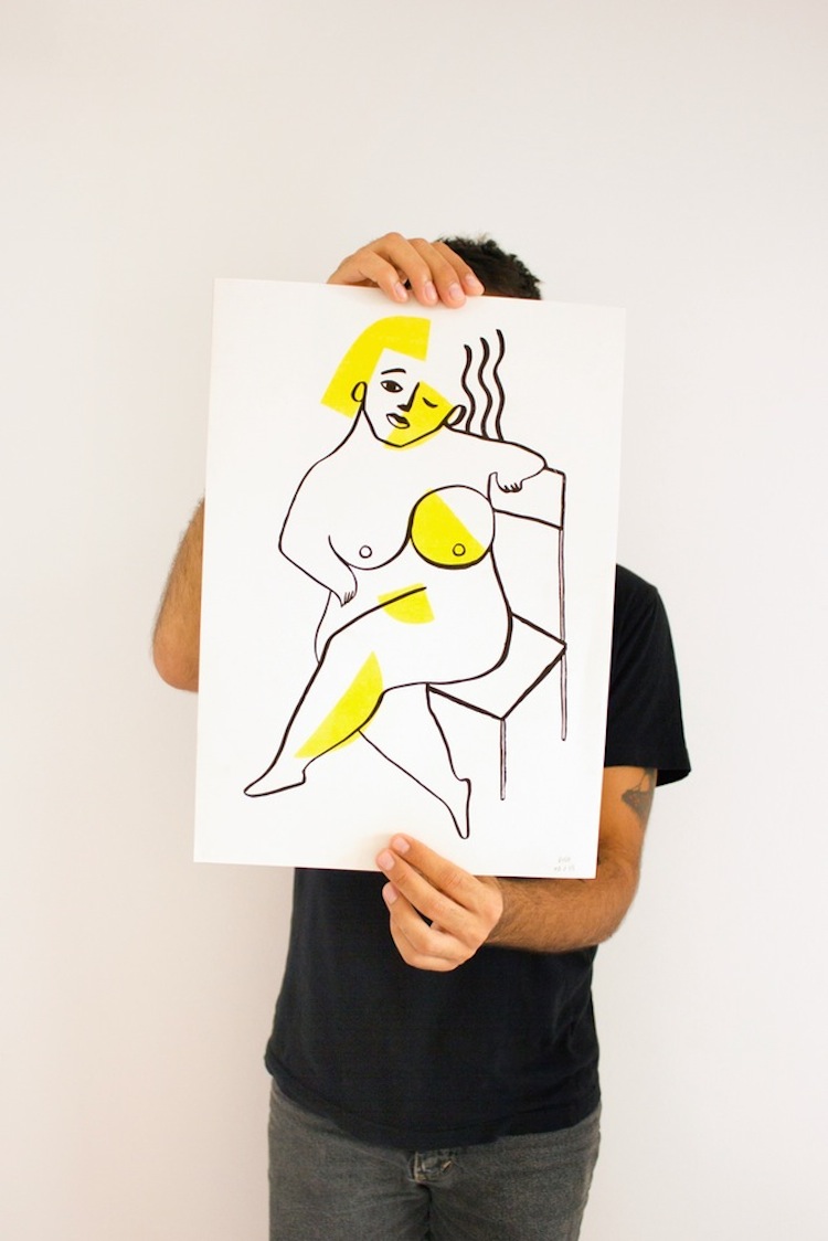
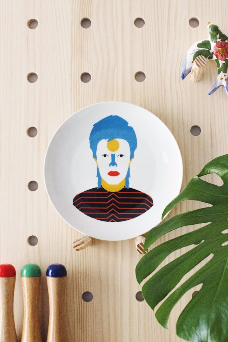
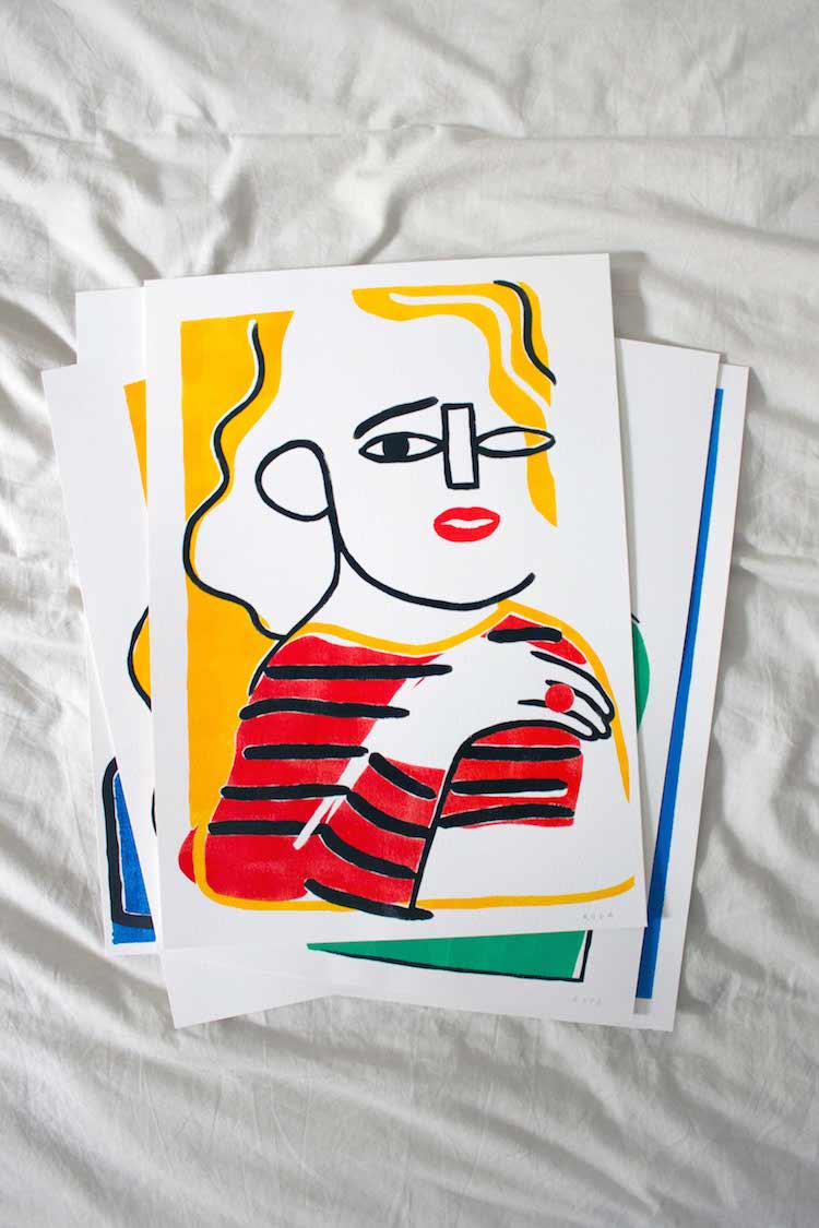
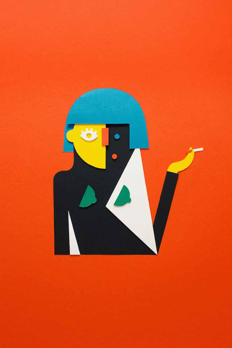
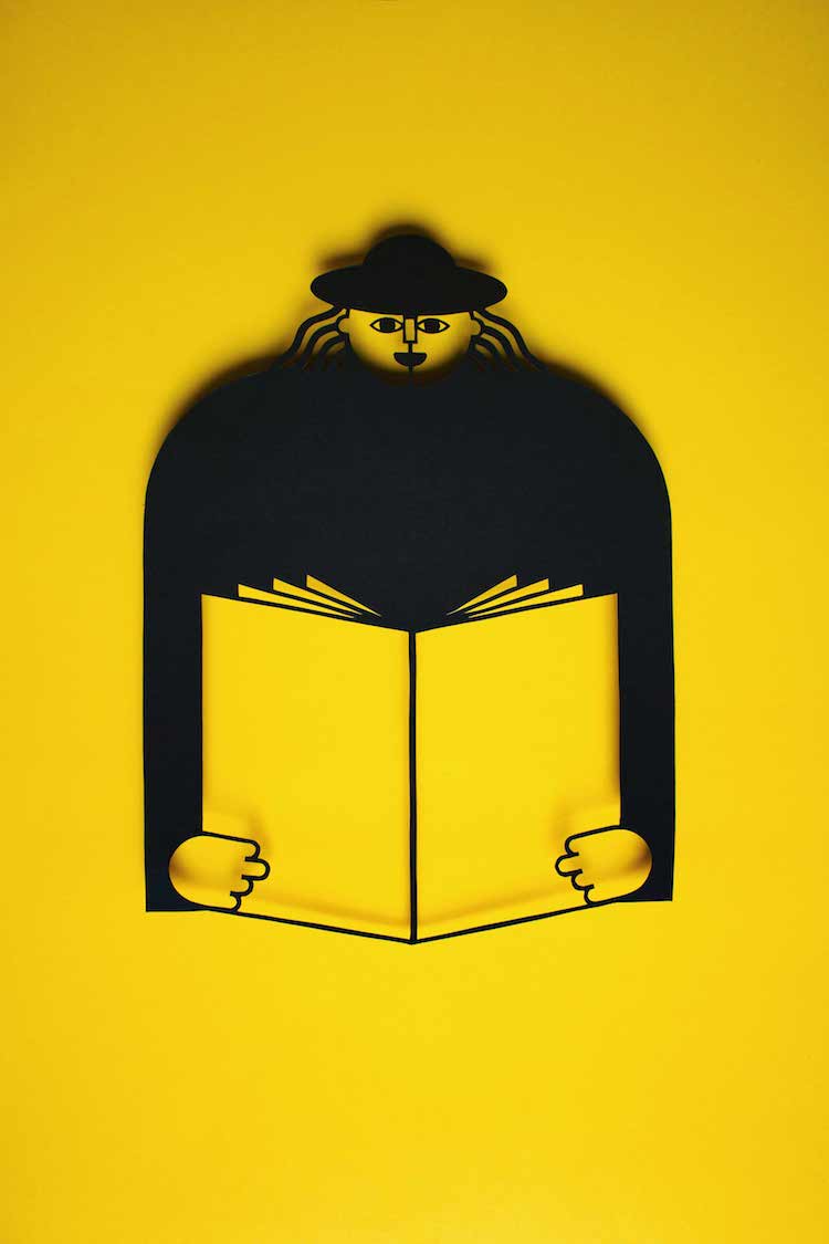
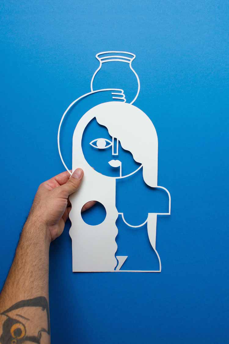
What instantly captured our eye with José Antonio Roda’s work is his use of primary colours. Roda is an illustrator and graphic designer currently based in Madrid. The primary colours used in his work complement the abstracted subject matter perfectly. In his work, merely a few shapes and colours (Roda uses red, yellow, blue, black and white almost exclusively) are able to come together to form beautifully clean images. Roda’s attention is split between silk-screen prints, ceramics, risography, digital prints and paper cuts.
His work is often sold in limited editions and the mostly hand-printed and hand-cut nature of his work means that each piece is unique. Even when he uses a machine to print his work with the risographs, variations occur across all of the images due to the nature of the process.
The majority of Roda’s pottery features recognisable portraits of well-known figures, such as Amy Winehouse, David Hockney, Frida Kahlo and David Bowie. Despite the minimalist, abstracted portraits that rely heavily on negative space, the portraits are instantly recognisable. This is a testament to Roda’s successful use of few lines and even fewer colours to say a great deal.
Roda’s images are a joy to look at and bring delight through their vibrancy and fresh simplicity – scroll through his Instagram now to feel instantly uplifted.
https://www.instagram.com/josearoda/
http://www.josearoda.bigcartel.com/

No comments:
Post a Comment