Mr Gresty, a multidisciplinary designer, illustrator and curator whose work is “driven by bold colours, simples shapes, and a sense of humour” aspires to bring positivity back into design especially through printed materials.
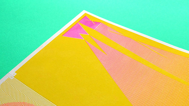
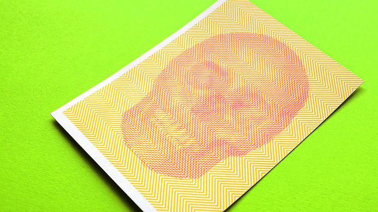
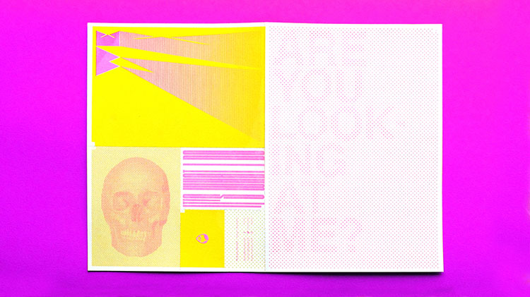
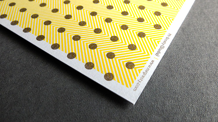
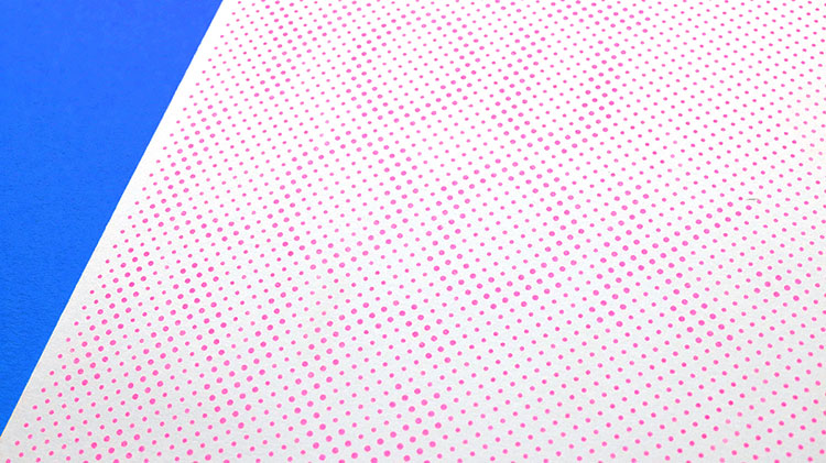
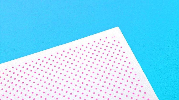
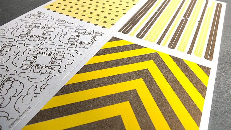
This is clearly visible in his 24 paged broadsheet newspaper printed by Hato Press called ‘Its What I do’ that includes two riso prints, an A4 hand perforated set of postcards and an A3 that demonstrates the A-sizes.
“In this digital age the simple pleasures and tactile aesthetic of the printed page is too often forgotten. That is one reason I’m driven to create works in print that thumb their nose at transient pixels.”
Mr Gresty’s justifies his decision to promote the slogan “print isn’t dead” by explaining that “printed materials can give your message gravitas, the recipient can usually peruse the content, giving the document the time and respect it deserves”. We certainly agree!

No comments:
Post a Comment