Working under the formula of Beauty = (Order/Complexity)•Sweat2, Happycentro, the studio founded in 1998 works tirelessly to broaden their unique portfolio, consistently approaching the design element under the same ideology, to solve a problem. From stop motion animation and graphic design to packaging and typography, Happycentro strives for contamination between creative disciplines and diversity, expressing their individuality through both striking and intelligent design.
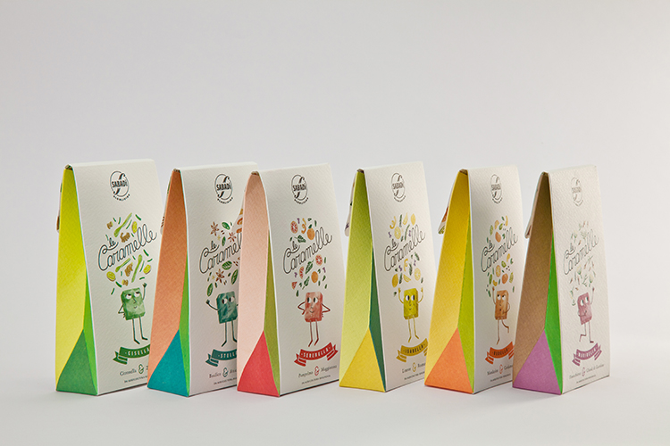
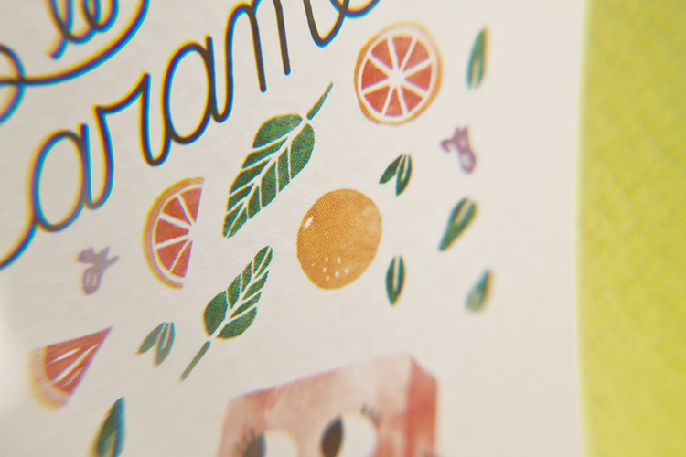
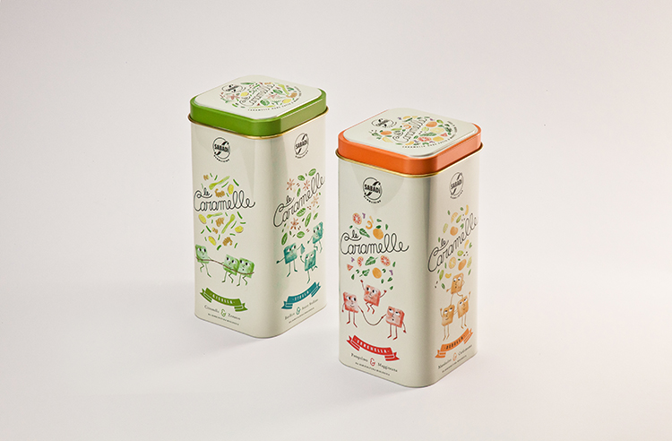
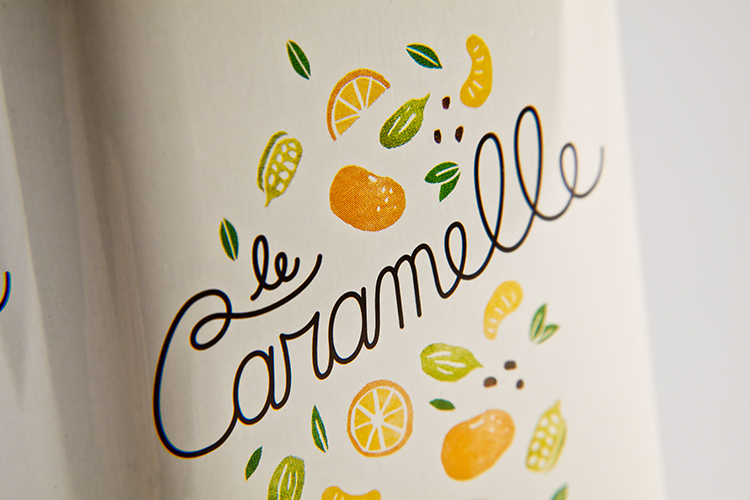
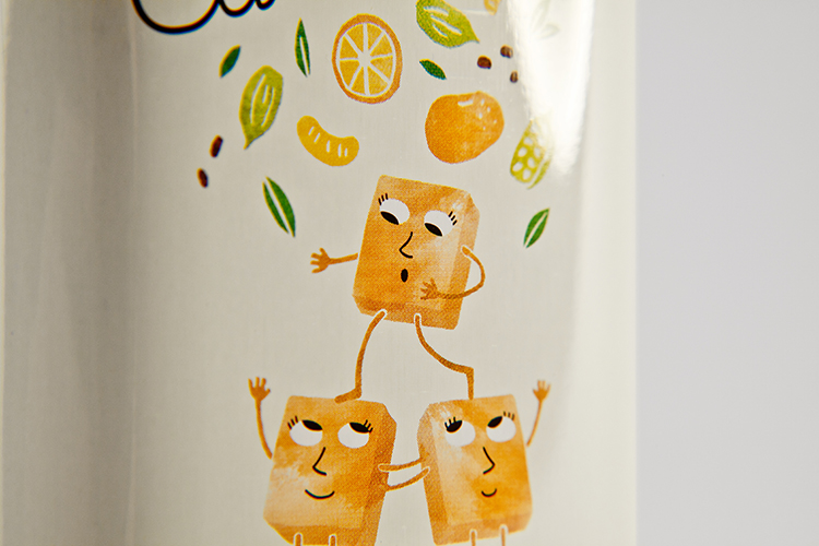
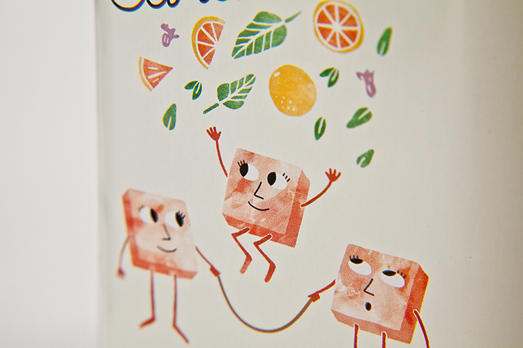
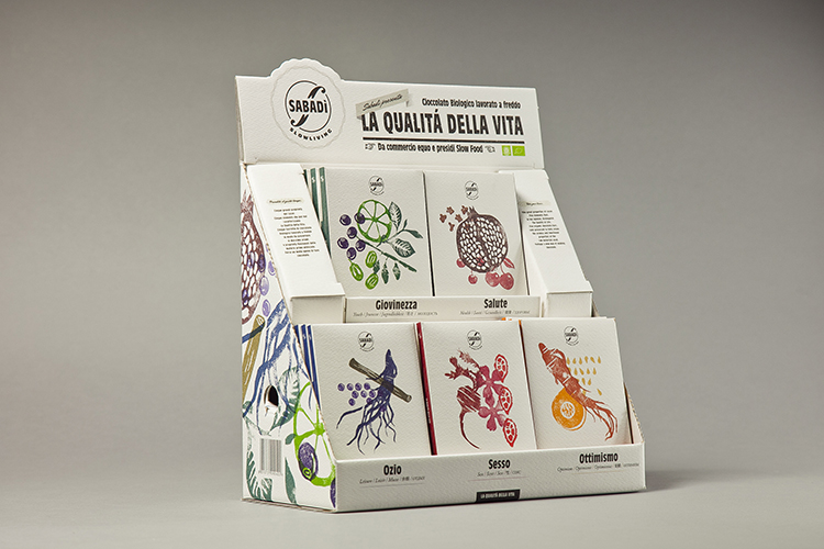
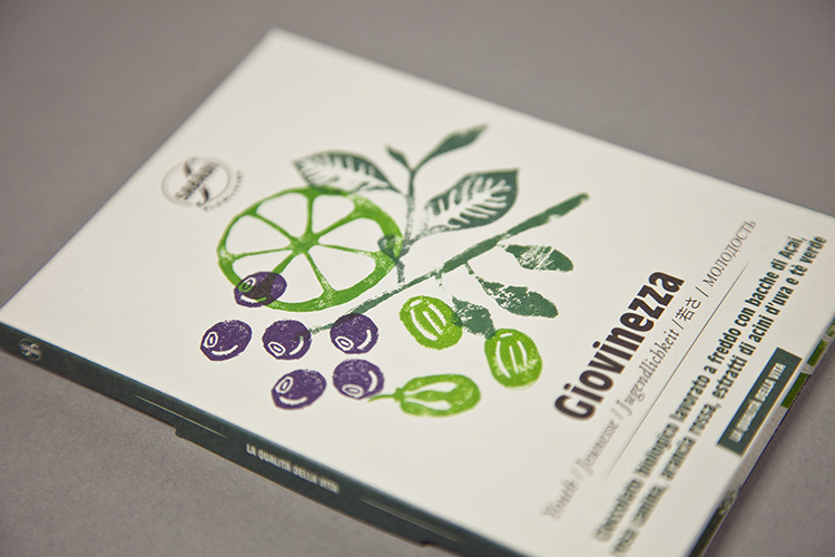
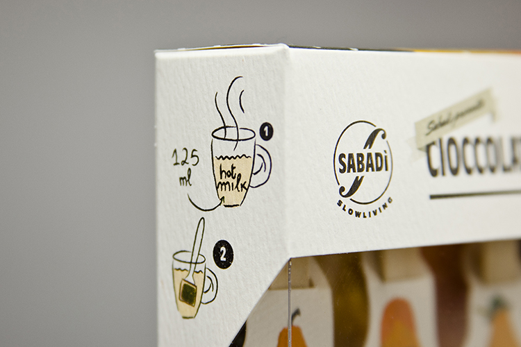
Collaborating with both major clients and tiny start ups, Happycentro delves into the contrasting worlds of geometric graphic design when designing the minimal cover of their How to use type guide to the personified illustrations decorating the adorable packaging of Sabadì’s Le Caramelle as seen below.
Working frequently with Sabadì, Happycentro have continued their collaboration with the brand, more recently designing the heartwarming packaging and identity for The Candies, maintaining the representation of raw materials used throughout, this time reflected through the joyous colour palette consuming the packaging, each colour reminiscent of the raw material used within each different recipe.
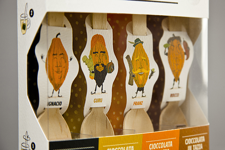
To enhance the adorability of the project even further, each contrasting flavour has been imagined as six mischievous personalities both showcased through the transparent packaging and the retro style cans containing assorted sweets, where the characters combine as the genuine flavours do.
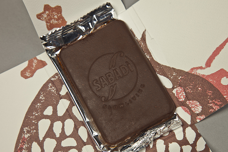
Experience a selection of the projects Happycentro have developed for Sabadì by viewing below. Intrigued? Check out their website here for more examples.





No comments:
Post a Comment