Slovakian Graphic Designer and Art Director, Kristina Bartosova embeds a confident consideration of personality into her creations, resulting in the powerful aesthetic which continuously informs her impressive body of work.
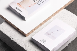
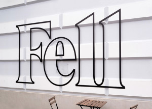
As of late, Bartosova’s recent projects detail her talents from editorial design to branding. Working with Fell Salon, Bartosova successfully translated the salon’s brand identity of mutual trust, quality and transparency through intelligently considered design details such as the minimal approach to calm typography, further enhanced by the ethereal use of black ink of recycled white paper. Material and texture are emphasised in direct reference to the hair theme at hand and thus what distinguishes one hairstyle from the next.
Photography by Lipp Zahnschirm is an equally dominant element of the core design, communicating the underlying beauty of simplicity and the personality inherent in the way we wear our hair.
Art Direction, Graphic Design & Styling – Kristina Bartosova
Creative Direction, Naming, Copywriting – Thomas Pokorn
Photography & Product Photography – Lipp Zahnschirm
Web Design & Development – Jürgen Genser
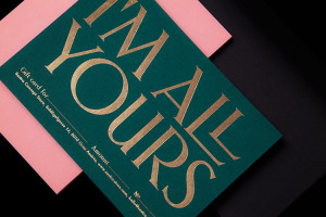
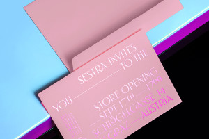
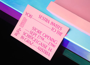
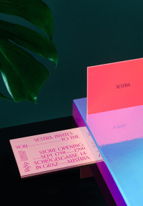
A contrasting aesthetic is detailed through the creation of Sestra’s branding identity. The concept store in Graz, Austria holds focus on both young European labels and hand-picked vintage garments, evoking a high fashion feel while still directing a nod to the trashy chic of the 80’s. This specific style is confidently imagined through the delicate custom typeface of logo and the rich colour palette is iconic of the vintage identity, while the dominant dual palette is yet another consideration, symbolising the two sisters who own Sestra.
Art Direction, Graphic Design & Styling: Kristina Bartosova
Creative Direction, Naming & Copy: Thomas Pokorn
Photography: Lipp Zahnschirm
Retouching: Kristina Bartosova
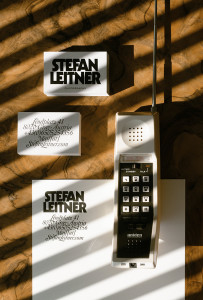
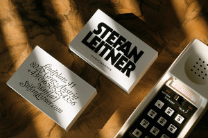
In order to embed both the bold aesthetic Stefan Leitner embeds into his work and radiates through his extrovert personality, Bartosova has reimagined Leitner’s name as a bold typeface. Simultaneously, a playful identity is apparent when subject to the reverse side of the business card, thus both sides complement each other to portray the nature of Stefen Leitner confidently.
Art Direction, Graphic Design & Styling: Kristina Bartosova
Photography: Juraj Bartos, Kristina Bartosova
www.behance.net/kristinabartosova






No comments:
Post a Comment